As anyone who has ever gone to a symphony concert will tell you, it is an immersive, transcendental experience. To make sense of the multilayered, ever-changing music that the listener is being treated to, orchestras provide program notes to read along to, giving the audience insight into the historical context of the written piece, the arrangement of the music, and the instruments involved.
![]()
![]() However, as with most technical writing, these program notes are often complicated, dry, and difficult to keep up with during the performance.
However, as with most technical writing, these program notes are often complicated, dry, and difficult to keep up with during the performance.
Hannah Chan-Hartley began working with the Toronto Symphony Orchestra to create visually engaging program notes that combine text and graphics to aid the experience of a live performance. These Visual Listening Guides have become so popular that she has started her own website, Symphony Graphique.
![]()
We invited Hannah to join us here at Musical U to share her thoughts on everything from engaging listeners with visuals and the importance of good graphic design, to the secret of striking the balance between accessible and informative, and what sets her guides apart from the rest.
Q: We love your listening guides and are eager to learn more about them!
Typically, when you go to a symphony concert there are program notes describing the music. What are you doing that’s different? Why is this helpful for audiences?

Hannah Chan-Hartley, managing editor and musicologist at the Toronto Symphony Orchestra
At the Toronto Symphony Orchestra (TSO), where I perform a dual role as the Managing Editor of the TSO’s program books and as a Musicologist, we still use program notes. They’re important not only for giving some general guidance for what to listen for in the music, but also for providing information about the composer’s background and the historical context that shaped the music’s creation.
For our notes, particularly in the description of the music, we try to find a balance of being informative and educational and also accessible and entertaining, so that audiences with different levels of experience with classical music can enjoy them.
But sometimes, people want a bit more guidance as to what they’re listening to, or more importantly, how they should listen to a classical music piece, and this means learning and understanding the terms used to describe a work’s structure. Written descriptions about form and structure tend to be dry and can make it difficult for people to understand what’s going on.
This is one reason I created and developed the “Visual Listening Guides”, which aim to show rather than tell about the structure of a symphonic work, so you can learn how to listen to it. Even so, the program notes still provide important information, and in the TSO’s books, the Visual Listening Guide is a supplement to the written notes, not a replacement.
Listening guides for musical works have existed in various forms since the 19th century.
Nowadays, you’re most likely to encounter a listening guide in a textbook, since they’re helpful for study and for teaching. In my experience as a music student and teaching university-level music appreciation and history courses, I’ve used various kinds of such guides.
In terms of design, these are usually in some form of a chart or table (occasionally a diagram), which outlines the structure of a work or a work’s movement through a list of themes and other major aural highlights of the piece, along with a brief description of what you’d hear. Sometimes these guides will include approximate timings of when you’d hear these highlights, as well as excerpts in musical notation.
While these guides are certainly functional in the context of textbooks and the like, they’re not particularly engaging visually, and the predominant use of text to explain music can still sometimes create a barrier to understanding the musical score. Therefore, those who cannot read musical notation would not find that aspect of the guides useful. So, I began to think about how to communicate the same kind of information but in a more visually dynamic design.
 The opportunity to create and develop my idea for the Visual Listening Guides came about in tandem with the redesign of the TSO’s program books, beginning with the 2015/16 season. At the time, we were re-examining the function of the program book and were seeking to make it more integral to the live concert experience while also providing interesting, informative content for our patrons that would encourage them to use it beyond the hall. The guides fit into this goal, so we began to include them for specific concert programs, and anyone in the audience, if they desired, could use them “in real time” with the performance.
To date, I’ve created 16 Visual Listening Guides (eight for the 2015/16 season, and eight more for the 2016/17 season), focusing on well-known symphonic masterworks of classical music. Over the two seasons, they’ve been refined in a few small, but important ways. For example, the graphic notation used in the guides now more accurately reflects the relative pitch levels and the note durations of the actual music notation (an eighth note, for example, is always represented by a dot). There’s also now a more consistent style in the way the visual and text language appears across the guides.
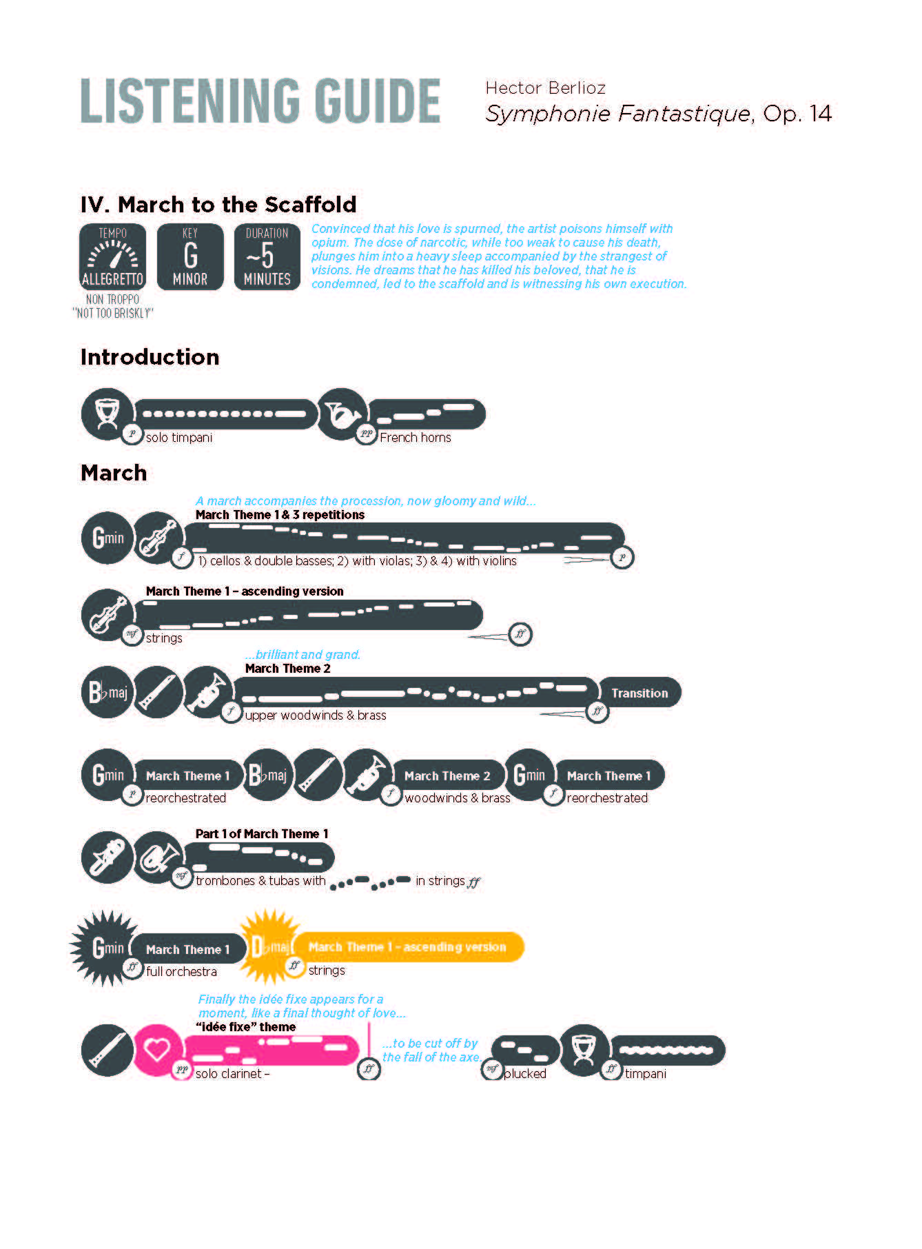
Depending on the musical work, I’ve experimented with some slightly different formats. For example, Berlioz’s Symphonie Fantastique has an accompanying text by the composer that describes what the music is portraying, so I embedded the description within the guide for this work:
For the guide to Sibelius’s Symphony No. 7, a work with a rather unusual form of a single movement, I included a timeline which indicates approximately when you’d hear key themes:
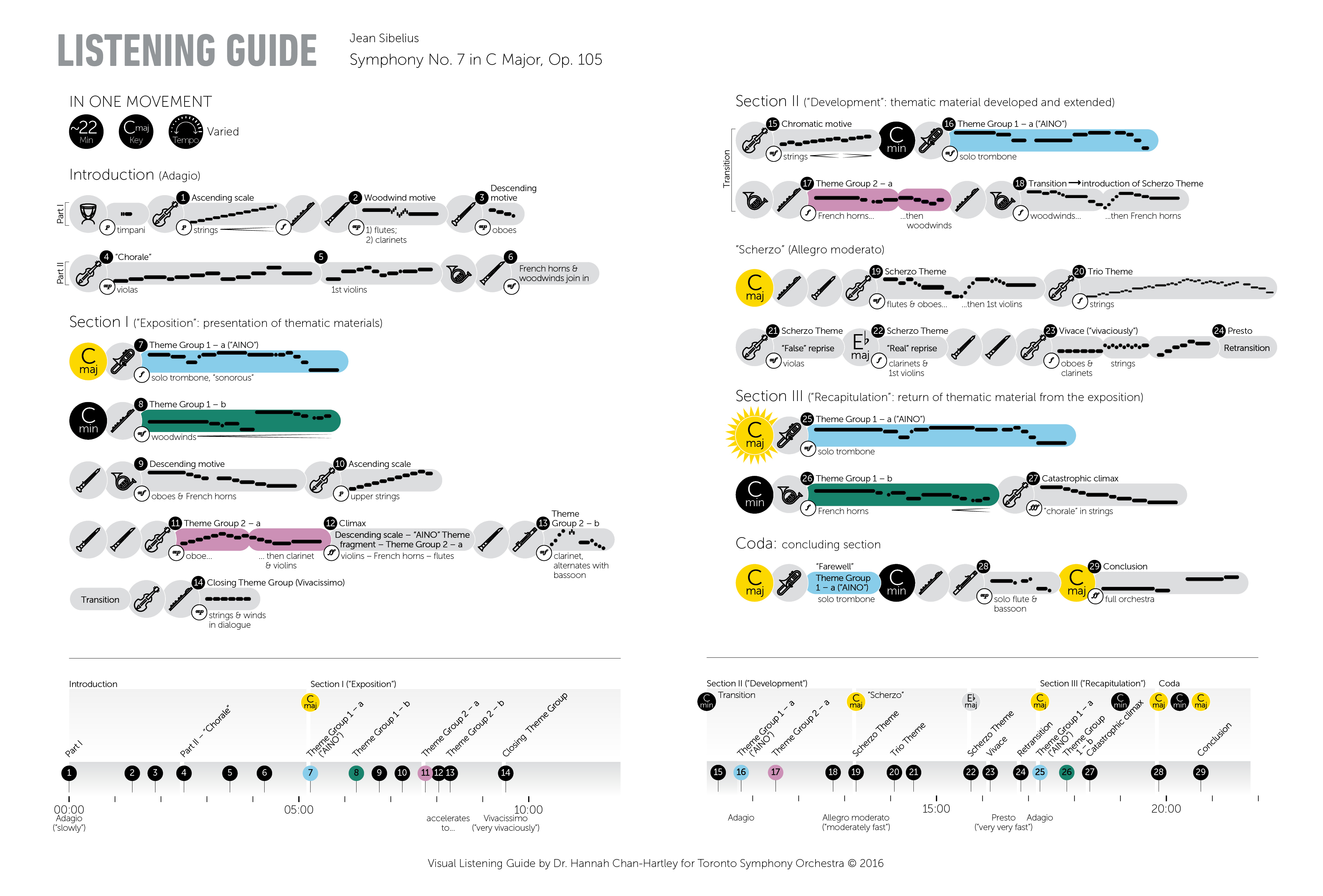
The Visual Listening Guide is intended to help you structure your listening of a symphonic work.
It is essentially a kind of map that shows you when the key musical themes and motifs appear in relation to the entire movement and/or the symphony, since the structure of the movement or symphony is dictated by the presentation, recurrence, and development of themes.
For the design, I had a few specific aims, chief among them being I chose to restrict the content of each movement of a work to a single page (or at the most, a two-page spread) in our program book. I wanted people to be able to grasp the entire form of the movement, at least on one level, at a “glance”. This principle basically shapes how everything else is laid out in the guide.
With the limited space, I have to prioritize the information to be included. Thus, I choose to represent the most salient musical landmarks of the piece in the guide. I select them based on what is most obviously experienced aurally, so that the guide reflects as best as possible the listening experience of the work.
”I aim to show more of the “big picture” of the work. My guides provide a visual “bird’s eye” view so that audiences can see the general idea and how it ties in with smaller details in real time.”
These sonic cues include: the main musical themes or motives of the piece, which are depicted in a graphic notation placed in “pills”; the instruments or groups of instruments that play the themes, as represented by icons; dynamic levels; and main key areas. Text is used sparingly, to label the pills (“Theme 1”, etc.) as well as to clarify what instruments are performing the themes.
I’d like to give a shout-out here to graphic designer Gareth Fowler, who works with me to execute the design of the guides, and who helped develop the graphic notation and created the instrument icons.
Thank you! It was one of my goals. Besides the graphic notation and the icons, I use colour, which I think plays a key role in making the Visual Listening Guides accessible and intuitive. Colour is used judiciously on certain main themes that recur throughout a movement or when applicable, throughout the entire work. On the page, I seek to ensure that the work’s structure is clear, by the arrangement of these themes and their colours. This was used to illustrate Mozart’s Symphony No. 41, 1st movement:
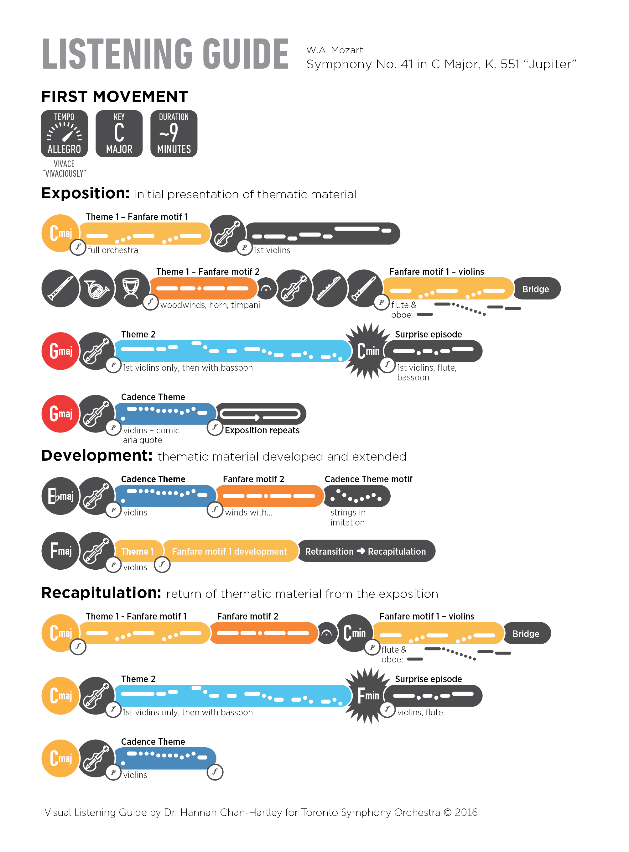
As with repeated listenings to a particular symphony, the Visual Listening Guides contain several levels of detail which I hope reveal themselves as one’s experience with the piece deepens. Somebody with little prior experience may see that Theme 1 (in the Mozart example above) comes back multiple times just by looking at the colours of the guide, and they may choose to focus on that during a performance, while someone with more experience may be interested in following the notation and other finer details in the guide.
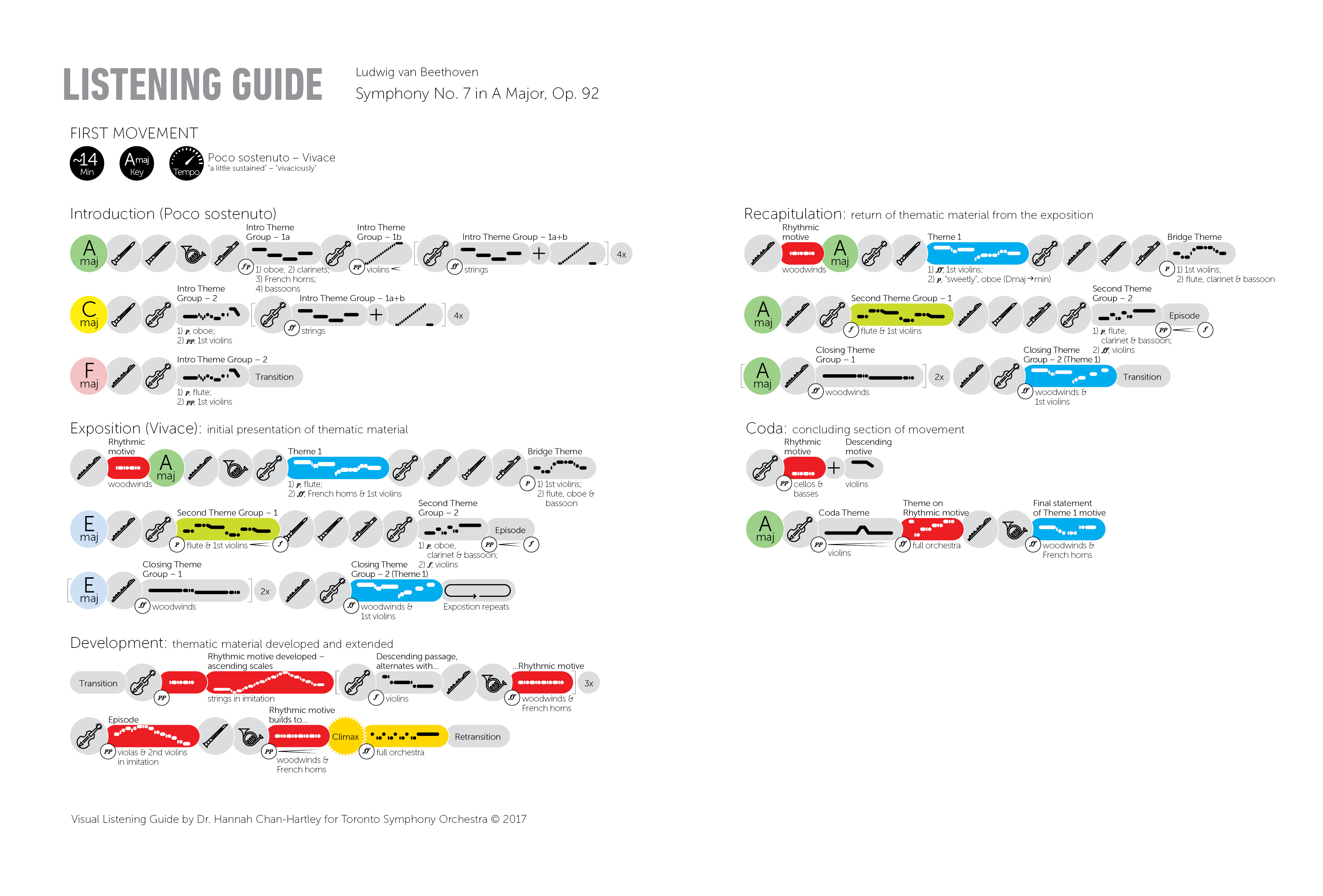
The colours in each guide are also specially selected to evoke the general mood of the movement, its themes, and key areas. For example, in Beethoven’s Symphony No. 7, the guide for the first movement uses very bright colours to convey its bright mood and kinetic energy:
Whereas the more solemn second movement uses darker colours:
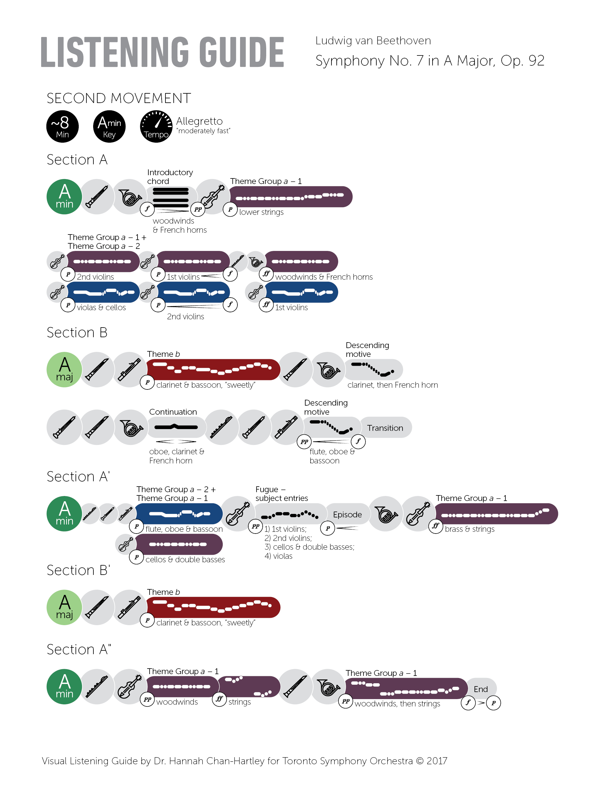
Although music-to-colour associations are somewhat subjective, my aim was that their application in the guides would add another dimension of connecting to and experiencing the music.
I should mention that to a certain extent, the Visual Listening Guide is an “analog” response to the growing number of digital apps that orchestras are having created to make the live concert experience more engaging and interactive, and to improve audiences’ understanding of the music.
”While these guides are certainly functional in the context of textbooks and the like, they’re not particularly engaging visually, and the predominant use of text to explain music can still sometimes create a barrier to understanding the musical score.”
While I commend these efforts and appreciate that many audiences do get something out of them, I do see some limitations with these apps. For one, they tend to be more-or-less textual program notes. In real-time, they function as a kind of explanatory subtitle format. However, because they try to avoid overly technical language (and this is a good thing), the descriptions of what you’re hearing are either overly simplistic or too prescriptive. The focus can end up being too much about the minute details of the musical content “of the moment” when sometimes, the most interesting aspects are how these details fit or are worked out within the whole narrative or emotional journey of the entire piece.
In my Visual Listening Guides, I aim to show more of the “big picture” of the work. My guides provide a visual “bird’s eye” view so that audiences can see the general idea and how it ties in with smaller details in real time. With text and visuals supplementing each other, the listener does not need to rely solely on subtitles given in real time.
![]()
The guides were initially published and distributed solely through the program book that you receive when you attend a concert. As we had hoped, people were taking the program books home, and as we’ve found out from audience responses via email and social media, some were using the guides for listening at home, while others wanted them for teaching. We’ve recently made them available as digital downloads for a small fee, so people can use them for these purposes.
So far, very positively! I see them being used in concerts. It’s been observed that younger generations of concert attendees are especially intrigued and absorbed by the guides, following along and even pointing out how it works to their parents and grandparents. Since we’ve made them available digitally, the guides have been purchased by people around the world.
We’ve also had a lot of positive responses and attention from the global design community, I think due in part to the burgeoning industry and interest in information visualization. The guides recently won a 2016 KANTAR Information is Beautiful Bronze Community Award, determined by public vote. Some people have expressed that they love the guides simply as design objects… and would love to have posters of them!
I’d like to continue to expand the repertory of the guides, and of course, I would love to see other orchestras try them out. I have some ideas about enhancing the original concept to include historical context and explanation as part of the visual design of the guides, and I’m considering experimenting with different ways to visualize other forms and genres. I’m also keen to explore how the guides might work as a digital animation that works with a recorded and/or live performance.
Thank you so much, Hannah! Please keep us posted as your vision for more and deeper access to music through these wonderful visual tools expands.
Visualizing the Vision
Hannah Chan-Hartley has made a big splash with her Visual Listening Guides. In fact, she now has her own website where you can view, purchase, and even commission your own listening guides. Learn more about this exciting new way to enhance the music listening experience at Symphony Graphique.
![]()
Visualizing music is an excellent way to make sense of the multilayered, multi-part masterpiece you are listening to. Try it out yourself: listen along to your favourite piece and create a visual map of each part of the music. What instruments are involved? How long does each part last? Do some parts repeat? You’ll be amazed by how much you’ll learn!